


Description
The forex market is like the sea. A vast ocean with both strong currents and calmer waters, constantly shifting throughout the trading day, driven by the never ending ebb and flow of opinion on a tide of sentiment that changes from ‘risk on’ to ‘risk off’ and back again. Taking advantage of these constant shifts in sentiment can be hard, particularly when we’re monitoring 28 pairs or more across the timeframes. The numbers are simply overwhelming, and with screen space at a premium it is an impossible task.
Even more difficult is identifying the change of sentiment, as it moves from trending strongly in one direction, then into calmer waters before reversing and trending once more. This is the cyclical price behaviour we see in all timeframes. But seeing these changes quickly, and profiting from them is challenging. This is where the Quantum Currency Array indicator steps in.
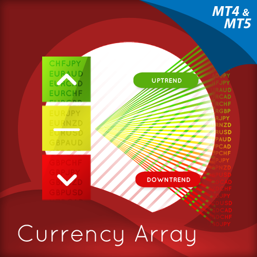
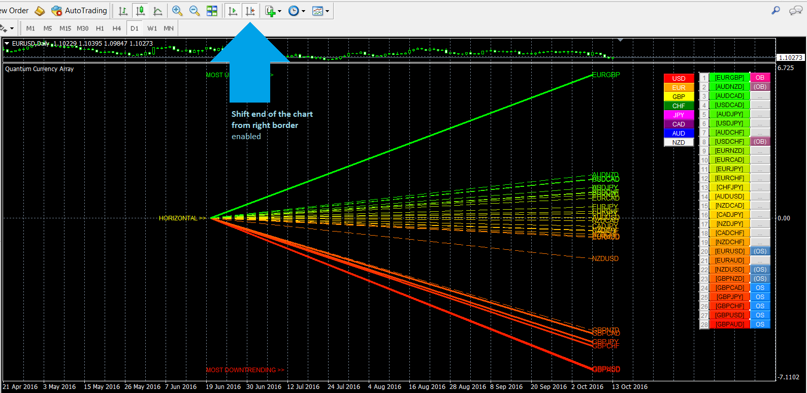
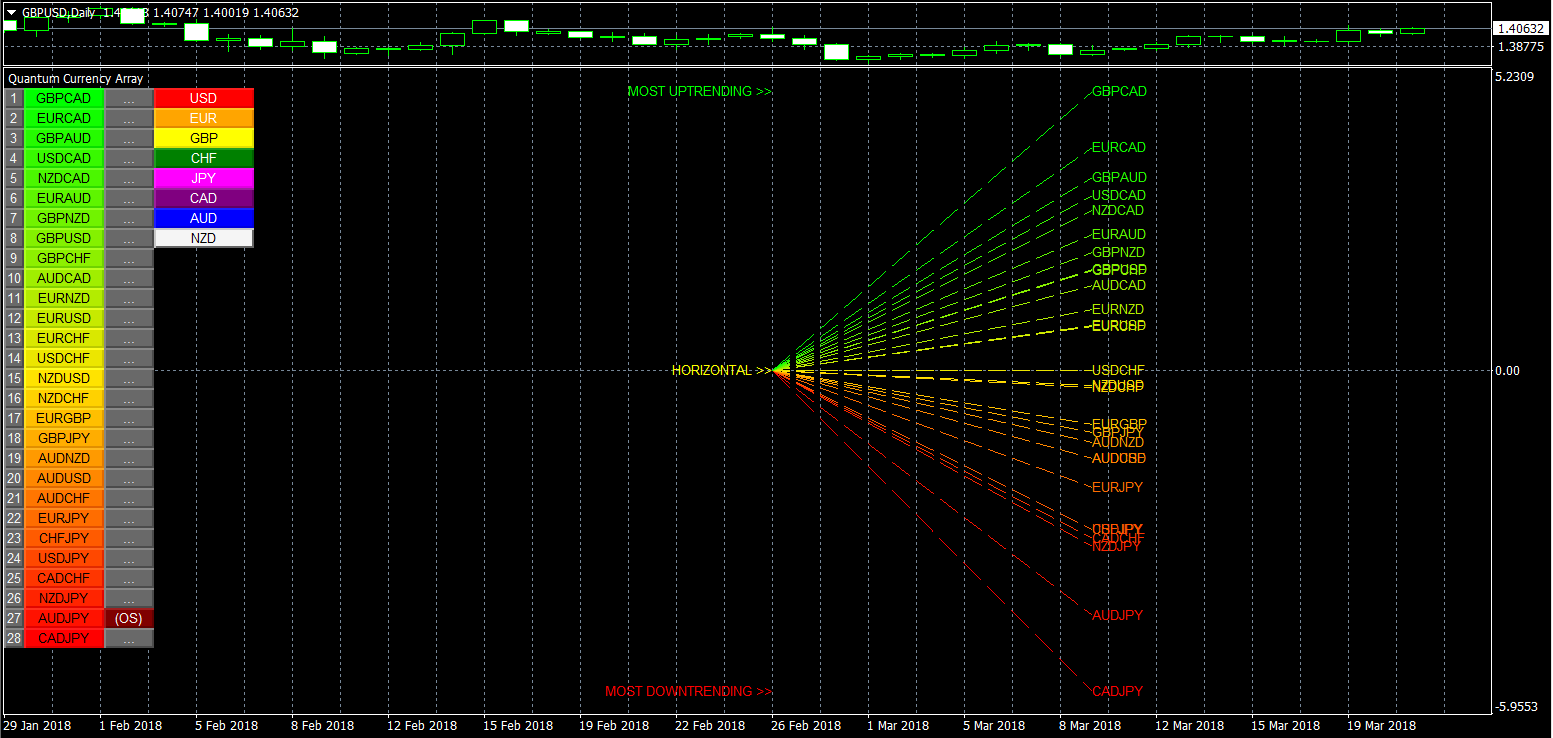
This indicator has been developed to identify and display these trends quickly and easily, allowing you to see instantly, those currency pairs which are trending, and those which are not – and in all timeframes, with just one click. The 28 currency pairs are displayed as a fan as they sweep from strong to weak and back again, and this is why we call it the ‘currency array’. All 28 pairs are arrayed before you, giving an instant visual description of those pairs that are trending strongly, those in congestion and those about to develop a trend, all in your chosen timeframe.
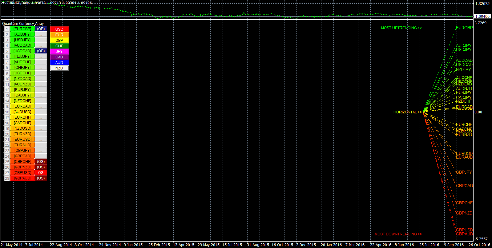
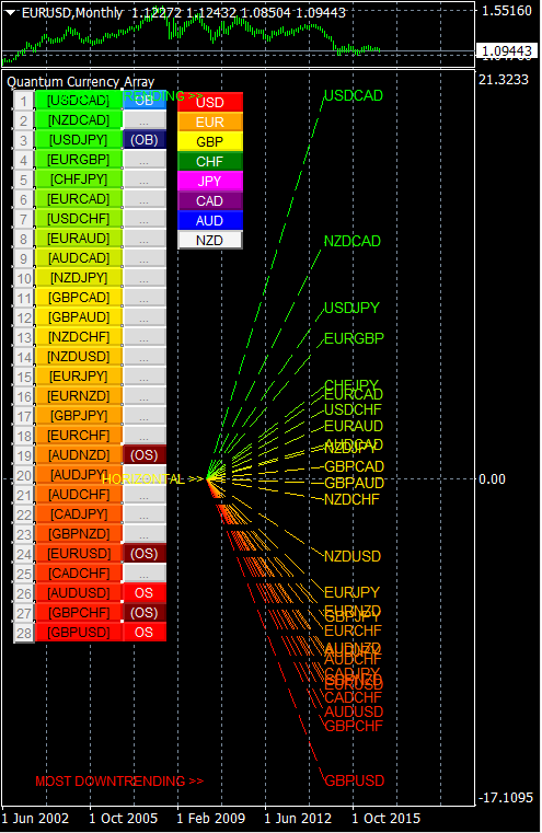
The Quantum Currency Array indicator displays all the 28 currency pairs derived from the 8 major currencies as featured in the Quantum Currency Strength Indicator namely: US dollar, euro, British pound, Swiss franc, Japanese yen, Canadian dollar, Australian dollar, and the New Zealand dollar. In displaying all the pairs in an array, this gives an instant view of their relative trend strength and reveals this relationship in a visual and intuitive manner in three very powerful ways.
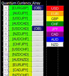
First, the indicator displays the 28 currency pairs in a ranked list, ordered by the strength of the trend. The currency pair with the greatest momentum and steepest uptrend appears at the top of the list – in other words the most bullish. The one with the greatest momentum and steepest downtrend appears at the bottom – in other words the most bearish. All the other pairs are then ranked accordingly, and color coded from red at the bottom through to yellow and into green at the top of the ranking table. Currency pairs in congestion appear in the middle of the table and are colored yellow.
Alongside the ranking list is a second column. This signals whether a particular currency pair is approaching an overbought or an oversold state, thereby providing an opportunity to profit from any trend reversal, and get into a strong position early. These states are signaled in two ways. First that a currency pair is approaching such as state, and second when it has arrived at the extreme. These signals are color coded as a dark blue or dark red for the ‘approaching an extreme’, and then bright blue or bright red once the pair is ‘at an extreme’. These are shown as follows:
- If the pair is at an overbought state : OB on a bright blue background
- If the pair is approaching an overbought state : (OB) on a dark blue background
- If the pair is at an oversold state : OS on a bright red background
- If the pair is approaching an oversold state : (OS) on a dark red background
Once any of these signals appears beside a currency pair, it is flagging the potential for an impending change in direction of the trend, which can then be considered further by analysis of the chart. For example, if the EUR/GBP is seen near the top of the table, and beside it is an OB signal, it means that although the uptrend is seemingly strong, the bullish strength driving it may be reaching an exhaustion point, and starting to diminish with a possible change in direction in due course. Time to check this on the charts.
Second, the indicator displays the same 28 major currency pairs as lines that diffuse out creating the array, with varying magnitudes depending on the strength and inclination of each currency pair’s trend. This means the order in which they appear vertically, follows the same ranking in the table alongside, but as a graphical display, instantly, visually and numerically revealing the actual steepness of each currency pair’s trend. In other words, the stronger the trend, the steeper the line. What you are seeing on the array is the directional momentum of all 28 currency pairs on one indicator, and in any timeframe. Priceless!
And as you would expect the currency pairs moving the most and with momentum, also display the steepest upward or downward gradient on the array. Currency pairs with little movement, and therefore in congestion, are found closest to the 0 level of the graph and appear horizontal or with little gradient to the line.
One of the most powerful features of the Currency Array indicator is when watching trends develop in real time, and how related pairs move together ‘en masse’. This will give you huge confidence when taking a position in the market, as you will see all the currency pairs for that currency complex ‘marching together’, stretching higher or stretching lower and reflecting market sentiment for that currency and its associated pairs.
This is immensely powerful, and will give you the confidence, not only to take a position, but then to hold it to maximise your profits from the trend. In addition, you will instantly see those pairs in congestion with a flat trend line in the array, which may be preparing to trend, or about to join a move of sentiment which has already begun in the complex.
And this leads on to the third aspect of the Currency Array indicator which is this – it will give you an instant heads up to divergence across a currency complex. The easiest example here is with the Japanese yen which is the counter currency for the major and cross pairs. On the array we should expect to see all the currency pairs on either one side of the mid point, or the other. After all, if the flow of sentiment for the yen is universal, then we should see all the yen pairs aligned accordingly, either with selling of the Japanese yen or buying. If not, then we have some divergence, and the flow of sentiment is not universal. If you are trading a pair which is perhaps counter to broad sentiment, then this is a higher risk proposition. The currency array will reveal this instantly and visually, and across all the timeframes with a single click and on ONE chart. No need to try to scan 28 charts. It is all here for you in a single powerful indicator.
One of the coolest features we have introduced recently, across all our indicators, is the dynamic graded color coding, found in both the ranked list and the array. This makes interpreting the indicator intuitive, and fast. The images make this very easy to see, but here is a fuller explanation:
The currency pairs appear as a color spectrum in the range of a green-yellow-red gradient (in that order). Simply put, the color of each currency pair varies depending on its value, in this case the steepness of the trend:
- Green shades – the steepness of the currency pair’s trend is positive and is well above the fulcrum of zero.
- Yellow shades – the steepness of the currency pair’s trend is relatively flat and around the fulcrum of 0. It can be positive or negative, but trails the numbers closest to 0.
- Red shades – the steepness of the currency pair’s trend is negative and is well below the fulcrum of zero.
The same color gradation applies to the array itself. It is important to note the yellow levels are not precisely in the middle of the list (rank 14 of 28). The gradation of color is dynamic, and hence the transition of colors will depend entirely on the steepness of the trend of each currency pair as explained above. As with all our other indicators, this is dynamic and is constantly shifting in real time, to reflect the ebb and flow of sentiment across the timeframes.
By itself, the Quantum Currency Array indicator is a powerful trading tool for identifying trading opportunities, quickly, easily, and on ONE chart. However, it was developed as part of what we like to call the Quantum Currency Dashboard which consists of the following indicators:
- Quantum Currency Strength Indicator
- Quantum Currency Matrix
- Quantum Currency Array
- Quantum Currency Heatmap
These four indicators provide a unique, powerful and compact insight into all the various aspects of strength and weakness for both currencies and currency pairs, from trend and momentum to overbought and oversold. What is unique is that using four charts, you are then able to monitor the myriad combinations of strength, weakness, momentum, congestion and divergence across the entire forex complex at the click of a button. And even more powerfully, giving you the confidence to get in and stay in for maximum profits. No more missed opportunities, no more struggling with multiple charts, and no more trader regret, whatever your trading style or approach.
So, why not add the Quantum Currency Array to your trading tools today, or better still consider all four, and take your forex trading to a new level with the currency dashboard suite of indicators.


